Project Overview
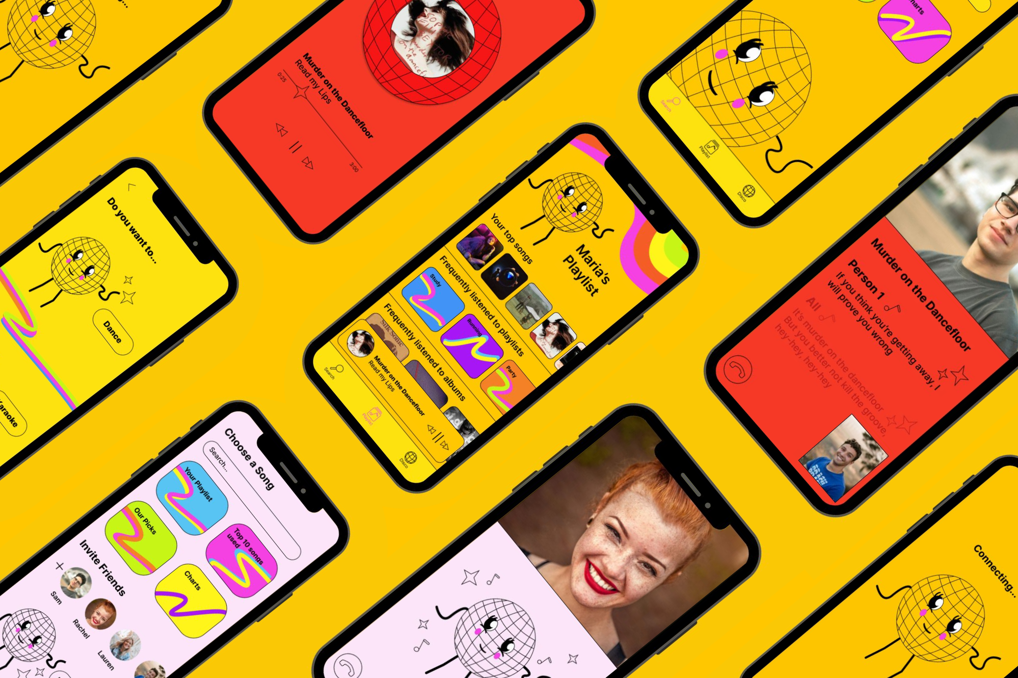
Music apps often lack interactive, real-time social features. To stand out, I conceptualised Sing and Groove, a retro- themed app that blends FaceTime karaoke and an interactive dance feature. The design channels nostalgia with neon colours and vintage visuals, offering users a fun and unique way to connect through music.
I was responsible for the end-to-end design process within a 5-week timeframe, focusing on user research, visual design, and prototyping.
Design Process
Competitor Analysis
I explored several existing music apps, noting their strengths and areas for improvement:
Apple Music: I admired the simplicity and bold colors but found the subscription management frustrating.
Spotify: Enjoyed the features like joint playlists and Spotify Wrapped but felt the dark design was too intense.
YouTube Music: Limited appeal due to overlap with YouTube; the main difference was the ability to play music in the background.
SoundCloud: Unique for its focus on emerging artists, a feature not common on mainstream apps.
Bandlab: Inspiration for music creation functionality, aligning with my app concept.
Initial Ideation
I aimed to create a unique, creative app reflecting the music industry's vibrant nature. Through brainstorming, I envisioned a retro, disco-themed app to stand out from competitors.
Sketches & Paper Prototypes
Initially, I struggled with unique UI ideas but was inspired by a circle design, reminiscent of a disco ball, to convey a fun, retro theme. This concept became the foundation of the app’s visual identity.
Wireframes
Wireframing helped visualise and refine the layout, leading to constructive feedback. I thought of incorporating a ‘Dance’ or ‘Karaoke’ feature, which aligned with the app’s interactive, fun focus.
Mascot Design: Evolution of Disco Man
I created a mascot, "Disco Man," evolving from a basic sketch to a vibrant, colourful character. Initially, I incorporated retro elements such as flared trousers but I adjusted the design for a cleaner, more screen-friendly appearance. The final version was colourful yet cohesive, aligning with the app's playful tone.
High-Resolution Mockups
Adding colour was a key part of the design process, as I experimented with different backgrounds and strokes to ensure harmony. I adjusted various aspects of the UI based on feedback to enhance usability and visual appeal.
Implementing Feedback
Home Page: Adjusted layout to include a "Listening Now" feature for easier navigation, similar to popular music apps.
Options Screen: Simplified the layout for a cleaner look, matching the retro aesthetic.
Facetime Feature: Added a connection screen and rearranged the layout to reduce clutter, enhancing the user experience.
Search Page: Designed a search page to complete the app’s functionality.
Prototyping
Prototyping revealed several functionality issues that were resolved, such as adding navigation elements like back arrows and a persistent nav bar to improve usability. This process helped refine the app, ensuring seamless navigation.
Reflection
This project allowed me to blend creativity with practical design, resulting in a music app with a distinct retro theme. By iterating through sketches, wireframes, and feedback, I achieved a cohesive, user-friendly design. The process taught me the importance of balancing visual appeal with functionality, which I’ll carry into future projects.


