Project Overview
Young people face financial challenges, from managing limited budgets to finding discounts and the best deals. Many existing banking apps fail to address these specific needs. Fairie aims to fill this gap by combining essential banking features with tools to help users save money, including a built-in price comparison engine and exclusive student discounts.
I was responsible for the end-to-end design and branding of the project. This included conducting user research, developing the brand identity, designing the app and landing page, and creating comprehensive brand guidelines.
Research
1. User Research: Banking & App Usage Survey
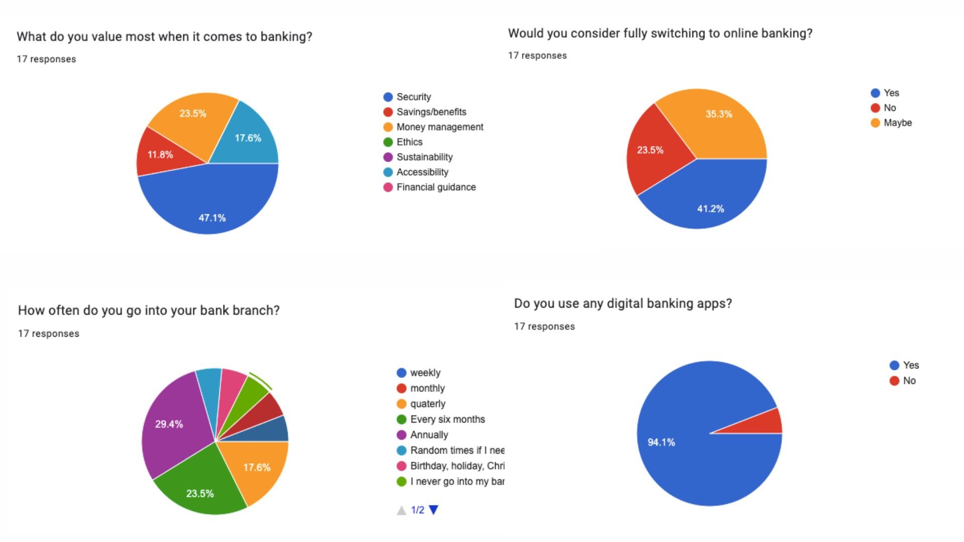
To gather perceptions, I designed a concise, easy-to-complete survey focusing on user experiences with banks and their mobile apps. By using a mix of multiple-choice questions and open-ended fields, I was able to collect both quantitative data and qualitative insights. This helped identify common user pain points and preferences.
2. Competitive Analysis: Insights from Banking App Reviews
Following the survey data collection, I conducted an analysis on existing banking apps, interpreting their reviews and user feedback:
Low Ratings for Traditional Banking Apps: Traditional banking apps were often rated poorly compared to newer, digital-only banking solutions. Users cited outdated interfaces and a lack of intuitive features.
Predominant Use of Blue in Colour Schemes: Most banking apps utilised blue as their primary colour, likely due to its association with trust and security. However, this colour psychology theory feels more like a strategic attempt to convey trust than a genuine design choice, prompting thoughts on how alternative design approaches could stand out.
3. Personal Case Study: Bank of Ireland Mobile Apps
Drawing from my own experience, I explored a specific case with Bank of Ireland:
Confusion Between Two Apps: When opening an account, I encountered confusion due to the presence of two separate Bank of Ireland apps, leading to a frustrating experience. This fragmentation could be a significant barrier for new customers.
Discrepancy in App Ratings & Functionality: The Bank of Ireland UK app was highly rated and offered modern features like Face ID login, while the regular app was poorly reviewed and relied on outdated code-based login. This inconsistency in functionality and user experience highlights a need for a more cohesive digital strategy.
Brand Development
1. Concept Ideation
During the initial brainstorming, I generated ideas to enhance the banking app experience, including features like budgeting alerts, economic news updates, price comparisons, and student discounts. After discussing these ideas with my tutor, I focused on integrating price comparison and student discounts, which were well-received and aligned with my vision for the app.
2. Establishing Brand Values:
I initially identified five core values: Secure, Trustworthy, Reliable, Convenient, and Accessible. However, after deeper reflection on the importance of brand values, I realised these were too generic. I refined them to better suit my vision, eventually finalising on:
Fair: Ensuring unbiased price comparisons to give users the best deals.
Secure: Prioritising user security, which emerged as a top concern in my survey research.
Convenient: Maintaining ease of use, a feature users highly valued.
Innovative: Offering unique and useful features to stand out in a competitive market.
Creative: Differentiating the brand through a playful, imaginative approach, making banking more engaging.
Fair Secure Convenient Innovative Creative
3. Brand Name Development:
Naming the brand was initially a challenge. After consulting with my tutor, who suggested exploring a "magic" theme, I brainstormed words associated with magic and fairytales. This led to the name "Fairie," which combines the idea of fairness (a core brand value) with a touch of enchantment. The spelling also pays homage to Irish folklore.
4. Tone of Voice:
The tone of voice is a key element in conveying the brand’s personality. By using phrases related to magic and fairytales, the tone will reflect creativity, reinforcing the brand’s unique identity and making the banking experience more enjoyable.
“I wish every purchase came with a built in discount fairie…”
“I wish there was an app that could magically find me the lowest prices…”
5. Branding:
I designed a sophisticated brand that blends a magical theme with modern elegance. The star-inspired logo, coupled with a rich navy and yellow palette convey ambition and strength. For the brand application, I wanted to let the brands tone of voice stand out.
App Development
1. UX Teardown of Existing Banking Apps
I analysed the Bank of Ireland app to understand its strengths and weaknesses.
Noted areas for improvement: Login security, home screen clutter, and redundant features.
Highlighted positive aspects like insights, advice, and simple design elements in certain sections.
Compared with a price comparison app (ShopSavvy) for inspiration on the scan and search functionalities.
2. Interface Inventory & Component Library
I broke down UI elements from the Bank of Ireland app to understand design choices. I created a component library using buttons and elements from the teardown, adjusting them to fit the new app design. I learned new skills in Figma to develop reusable design elements, improving efficiency during the app-building phase.
3. Sketching & Iterative Design
Initially I struggled with digital designs; I reverted to sketching layouts to free up creativity. I sketched multiple design ideas, which sped up the digital design process and led to better outcomes.
4. Key Design Features
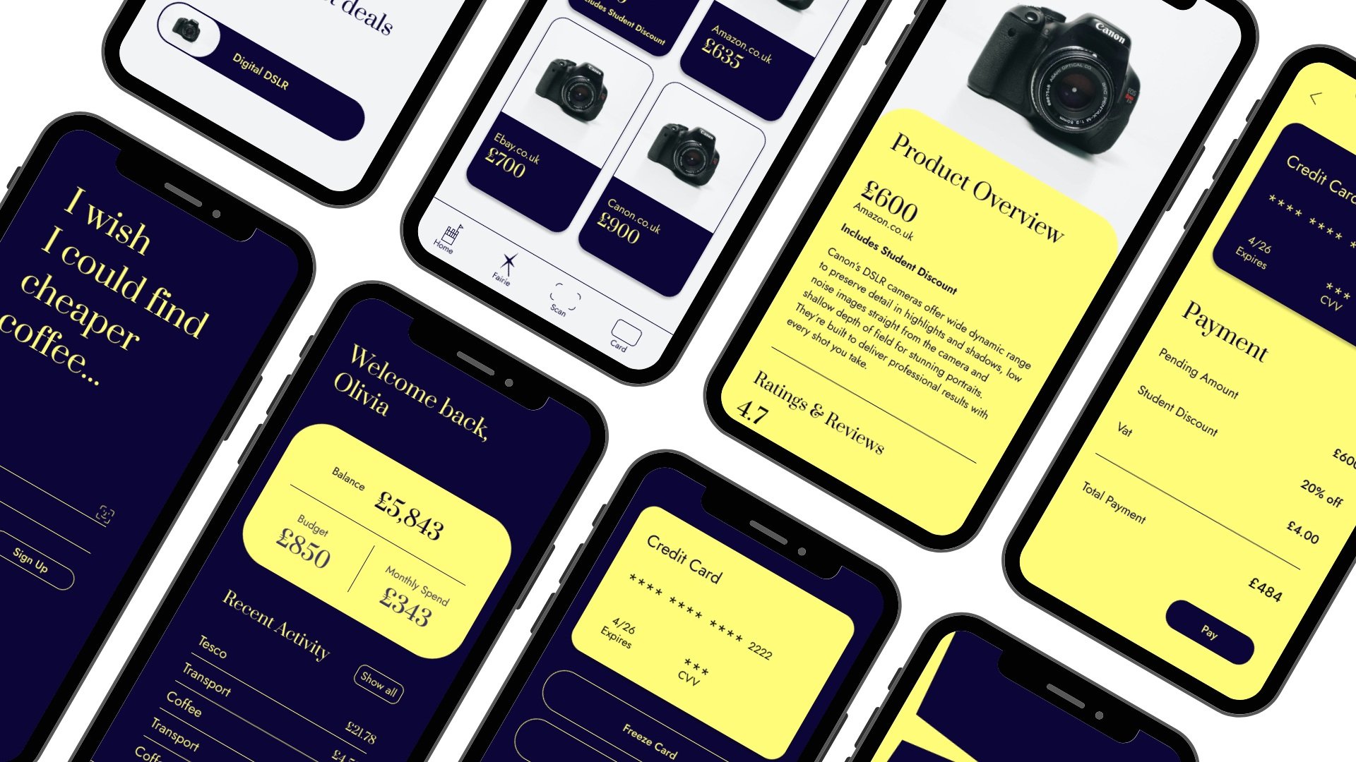
Login Screen: Added FaceID for faster, more secure access. Replaced keypad, aligning the layout to the left for a modern look.
Home Page: Iterated on the design to improve visual appeal, aiming for a balanced use of color (yellow highlights).
Search & Scan: Integrated a playful yet functional design by renaming the search bar to "I wish" and incorporating ShopSavvy-inspired scanning features.
Product Display: Developed a bright, cohesive design with integrated shopping features, balancing between direct purchases and retailer links.
Payments & Cards: Took inspiration from the Bank of Ireland’s design, adding a personalised touch with user profile pictures for a modern feel.
Landing Page
1. Identifying Key Information & Structuring Content
I began by completing a task in class that helped prioritise the most important information about the brand and its logical presentation order. This exercise guided the content hierarchy for the landing page design, ensuring clarity and ease of navigation.
2. Initial Sketches
I started by sketching out several layout concepts, experimenting with different arrangements of text and visuals. This helped refine ideas before jumping into digital mockups, allowing for more fluid exploration of concepts.
3. Digital Mockups & Iteration
I translated the initial sketches into digital designs, testing out different layouts and approaches:
First Concept: Experimented with a star shape design, but found it visually awkward and impractical.
Second Design: Tried to balance large, dramatic text with phone visuals, but the text size made it hard to see the product clearly, leading to a cluttered feel.
Third Attempt: Repositioned navigation buttons and grouped product visuals to make information easier to grasp at a glance. Still, the design felt too cluttered with unresolved spacing issues.
4. Refinement & Final Design
I decided on a layout that combined the best elements of previous iterations; Clean, bold typography to grab attention and communicate the brand's tone. Simplified navigation with links, including a call to action for downloading the app. Later, I adjusted the layout to showcase product visuals prominently, ensuring that users could see what the app does without excessive scrolling. Finally, I refined spacing and reduced unnecessary elements for a cleaner, more focused presentation.
Brand Guidelines
The final step in my branding process was creating a brand guidelines document- a comprehensive guide that defines the brand’s aesthetic and provides instructions for applying its elements.
Conclusion
This project taught me the value of research in shaping a cohesive brand. Initially eager to skip straight to visuals, I came to appreciate how research informs design decisions. Developing the logo, wordmark, and colour scheme was challenging but rewarding, while creating the app and landing page became my favourite tasks, bringing the brand to life.
Through this experience, I improved my time management, learned to balance research with design, and gained confidence tackling complex branding challenges.


